Showing posts with label contextual portfolio. Show all posts

Wednesday, 3 February 2016

Essay, Expanded.

Because the Wednesday (27th) and Monday (1st) Seminars were rather similar in what was discussed, Iv'e decided to group them both here, rather than repeating myself.


When deciding how to develop my essay question, Culture/Subculture, further, I decided to look into the things that I liked and could discuss, before eventually settling on the idea of music.


The way that music is designed for, and by extensions to cultures and subcultures within them, have a lot of potential for discussion, as well as how the various styles have developed along with the music, and the influences they will have had on one another.

The two major genres I want to discuss are Punk and EDM, as I believe they are the best at representing two different ends of the spectrum of design.

Saturday, 30 January 2016

How to approach Sound Visualization

In the Wednesday Seminar we were shown the many different techniques we had available to us, as well as how to think a little more logically with more digital processes.

The majority of the work shown to us was James' own, and discusses a lot of the technical details of creating visuals for sound, such as manipulating pitch and different levels as inputs to create visuals, and even using visuals as the basis for creating music.

This session generated many ideas for my own project, and whilst I may not have the technical knowledge to hook up a contraption to visualize sound (yet), it doesn't mean I can't execute these ideas manually, with the logical mindset that a computer would use when it activates.

Tuesday, 26 January 2016

Exploring G# Minor: Mozart to motion graphics

In this Lecture, Sara added context to our Studio work by discussing her own work within the field of visualization of sound


The key ideas I got out of it (beyond the ones I came up with to try within my own project) is how the music and visuals need to reinforce one another. If the music is emotive in a particular way, the visuals need to reflect that, helping to sell the narrative of the music.

There needs to be a harmony between the two elements, or the dissonance needs to be thematic.

Tuesday, 19 January 2016

Essay

Whilst initially given the initial basis for the essay before we broke up in December; we've begun working on the question we'd be choosing to write about, as well as the contents that will make up the work.

The three questions are "Cultures/Subcultures: In relation to graphic design", "Branding/Antibranding: In relation to graphic design" and "Prequels/Sequels: In relation to graphic design"

In this process we will be doing all of our own research and generating our own points to discuss within the essay.

I have decided that I will be exploring the "Cultures and Subcultures" question for my essay.

Monday, 18 January 2016

Visualization of Sound


For our newest project, we've been tasked with creating 8 pieces of unique and interesting visual responses out of 11 possible songs, trying to make the responses meaningful and thematic to the songs we're trying to visualize.

For this project, we are to include any number of techniques to create the responses, Including both moving and static pieces.


Because of the vast amounts of tools and techniques available, it's important to define what is and what isn't possible with the constraints Iv'e been given (two pieces a week)


Some of my ideas, right now include;
Rotoscoping myself dancing, seismology graphs, cymatics, kinetic typography, iconography, representing the data; and so forth.

Wednesday, 9 December 2015

Narrative Design

When developing visual communications, the usage of Narrative Design is of key concern.

 
When discussing narrative; it's important the establish the key components of one

  • Exposition: The set up and explanations of a subject or scene
  • Rising Action: The content that gets you invested/entertains
  • Climax: The peak where one or more narrative beats are resolved
  • Falling action: The winding down of the story
  • Denouement: The resolution of  any remaining elements.

However, from a designers point of view; Our take on this structure is not as simple nor is it as conformative to this structure, as we typically need to illustrate or demonstrate the solution to a problem, rather than tell as story (Not that the two can't exist in the same narrative).


We need to tune ourselves to our audiences when creating the messages we need to send them, rather than them tuning into us; creating emotional connections and narratives to the things we want to sell, so that people could buy into.

All of these things are built up with the use of Imagery; Sometimes being enough to carry a proposal or narrative on its own, Tones of voice, Using scale and placement to invoke tones of voices(Loud or Quiet, Impacting or Subtle ect), Symbols and inconography; Restricting information to alter an audience's perceptions or using simplicity to help sell the product, and colours; helping dictate the moods and feelings an audience should have of your work.

Thursday, 3 December 2015

The Substance of Style

Style, in a very brief explanation, is who you are; what you do and how you do it. It's a culmination of all the influences you've been exposed to and is how you view and interact with the world.

No one is free or acts outside of Style. Everyone has one.


Marcel Breuer noticed this idea of style and how it often dictated the work and artist or designer would create, and decided to divorce himself from it; creating purely logically designed items, and removing everything he deemed 'excessive' or 'non-important'.

However, Apathy to style is a style, in and of itself, and was eventually replicated and adopted into culture.


Styles are structured by their hierarchy.

Styles are made up of Classes> Which are made up of Attributes> which the Attributes can Change. 

Wednesday, 2 December 2015

Message and Meaning: We swim in the Media Ocean (and we control the waves)

Designed Messages always need to be understood the same way, by every time, by everyone, as well as have them react appropriately.

It'd be no use if an advertisement from Asda was cryptic and no one understood it, and the ones that did decided not to shop their.
That's a bad message they'd be sending.

Messages is the word for any communicated transmission from one source to any receiver, such as a poster or a spoken message.
Meaning is what we mean when we talk about the source of the sender's message, or their expression, and is what the receiver infers the message to be,

Often times, the ways in which a message is sent is just as, if not more, important than the message itself. It's crucial, as a poorly optimised transmission could lead to receivers have a hard time understanding your message, or not understanding it at all.


Senders is the term used to refer to designers when used in this context, or Encoders. We're the ones who translate meanings into symbols or forms to be sent as a message.
These messages need to be visualised from the point of view of the receiver, or the audience, so we can create the message more effectively, to be targeted more effectively. The more data we, as encoders, have, the easier it is to target and structure our messages.
     (-this is all important, as if decoders aren't effectively communicated to, then they won't buy into
        your message and ultimately, whatever it is you're trying to market-)


When deciding on the correct way to send a message is also important, as you need to pic the correct Channel, or the method that the message is sent (as stated two paragraphs ago). Essentially, there need to be some basic questions that you ask yourself as you're putting your message together, from the point of view of your audience (as stated last paragraph).

Some of these questions include;

  • Is it Urgent/Time sensitive?
  • Is immediate feedback needed?
  • Does a permanent record need to be kept
  • Is the content complicated? Private? Controversial?
  • Is the content be communicated inside or outside?
Ideally, you'd want your message to make use of as many appropriate channels as possible, with some being more appropriate than others. The radio may be an amazing place to advertise a new song, yet a poster could lack the content. And vice versa for more visual advertisements. You need to be constantly aware of the medium and message you're trying to present.


Design Authorship is a slight deviation from the established norm in the graphic design industry, in and that it's the Designer themself that's in control of their own messages and the pursuits they take to express them, like Anthony Burrill, pictured above.
These designers often take a much more self contained artifact and use it more in place of a directed message, rather than the broad and generic messages favoured by businesses.
-

The receiver, or decoder in this instance, is what we would call our audience. The ones that we market towards, and we need to be mindful of how we approach how we word the messages we send them, in order to maximise the amount we can manipulate and influence their actions.

This topic was covered rather extensively by the psychologist of the hour, Marshall Mcluhan, who documented the effect the media had on the public.

He stated that media could only ever be an extension of knowledge, and extension of an ideal, of what we already know, and could not be a replacement for it.
That we shouldn't try and understand the media by thew words it uses, but why the words are used, which will in turn make it easier to construct future media, for the purpose of the audiences viewing it.


He postulated that the world and media isn't something that we don't understand, or at least the audience at large didn't. They didn't care about the people or the motives behind the media, and this made it easier for those people to get their messages across.

People like to have their preconceived ideas and beliefs confirmed, people seek out affirmation and validation in the things they buy, so it's probably best that we, as designers, try to stick to hegemony and certain expectations for people.
People also hate feeling like they're missing something, behind the curve or not experiencing something good. Creating a world of haves and have-nots greatly enhances the chances that more of your audience will want to buy what you are marketing.

People also want to find goals to fulfill, no matter how easy or trivial they might be, even in lieu of how fast the world moves around them, so it's nearly impossible to complete any of them; as though the you, the ball and the goal are all moving as you step up to score. 
Because of this, it's important to create advertisements that meet these certain needs, as well as last long enough for them to be 'completed'

Saturday, 28 November 2015

An Introductions to Intros and Abstracting the Abstractions

In our Wednesday Seminar with James, we discussed two important concepts in writing; abstractions and clipped writing.
The later I am already demonstrating, using as few words to get my points across as I can (which, for someone who likes to add 'pith' or excess to my writing, is rather difficult). This is try and keep a consistent pace within the writing and getting as much content into the words as possible.

An abstract, on the other hand, is a device used as a 'hook'; a way to outline an argument or discussion, essentially telling people why they should care about what I'm writing about.

For example.

"My work in the studio shows the links drawn between their personalities, and the shoes they wear, and how both of these factors perhaps affect one another."

Monday, 23 November 2015

"To be an artist is to be a man": How we think about gender and sexual differences.

The 1960s were a time of great change in America. The civil rights movement was in full swing and the war in Vietnam was still taking the lives of countless soldiers every day. However, another liberal movement was taking place during this time; Feminists were campaigning for equality in all works of life, including in art.

During the 1960s (and still, even today) society's hegemony revolved around the strength of the Patriarchy and Heteronormativity of WASPs, with many people still trying to strike out and fight against the the established beliefs and gain equality, be in for women or for people of colour, with the only way for one's voice to be heard is by banding together under one banner.

The women artists created the 'Women Art Revolution' (WAR).


The issues in society at the time (and still, even today) was how little recognition female artists were receiving, or even just exposure in any form of official gallery, where there could be over 15 more men's work when compared to women, where men had complete dominance over both the art that could be seen, and where it would be shows.

The inequality between women and men was not only an acceptable standard in the industry, but many men used and exploited it to ensure their dominance and control over it was cememented.


As well as this, all forms of art, be it high or 'low', has begun to regress into a state of 'muted simplicity', that aimed to be pure and free of the politics surrounding it.
As it stands, the way minimalist art was constructed and displayed shows a general ignorance to the state of society around it, as though it was produced to be purposefully silent during this time.

At the turn of the decade, during the 1970s, there was a great rejection of the established regime of government off of the back of such incidents as Watergate, leading to the art of the time turning against society and almost boycott it. However, however ironic (and stupid it was), these 'anti-government institutions' would not allow women to display their art within their galleries.

This meant women began to create their own.

Feminist art began being taught in colleges, leading to a huge liberation in how women's issues and stigmas were perceived and then ultimately lifted, or just talked about.

Howardena Pindell

In the UK, however, the liberation of women in art took a much more academic approach, with the rejection of traditional art history teachings.
 Rather than Women simply 'accepting "what is" as "normal"', they began challenging society and education, claiming that 'the fault is not with the stars or their womb or anything else, but how they are taught their gender differences make them inherently 'worth less' than men' 


This Ideology is carried back throughout history, back into the furthest classical art, where men art shown as brave, strong and honourable heroes, where as women are shown as weak and onlookers to men's greatness. When this work carries on throughout history, it almost transcends culture and becomes a part of our nature, where women are almost born submissive, and men dominant, because of how long these roles have been assigned.

Influences and Behaviour: How to manipulate people and sell products.

As is becoming common, I have something of a foreword to add to these blog posts just to add a slightly less academic statement before we kick off with the intellectual studies.
This lecture makes us sound a great deal like terrible people, and I'm almost certain there are some graphic designers that aren't, I just figured that was worth mentioning.
Anyway, on with the writing.

This lecture was all about how we, as graphic designers, design around our audiences to influence their behaviours, so their reading to whatever it is we produced won't be opposed or negotiated, but rather preferred.

This is more commonly known as Manipulation: Changing someone else's actions and/or beliefs,       often without them knowing.

This concept was popularised after the second world war, when propaganda was no longer needed to stimulate the masses, men like Edward Bernays created Public Relations off the back of what was learnt, using the conscious and intelligent manipulation of the organised habits and opinions of the masses to get results in marketing, and such.


One such campaign that focused heavily on this, produced by Bernays, was the 'Torches of Freedom' campaign, which ran tangential to the women's rights movement at the time, essentially using is as traction and associating the brand with it, meaning one would be synonymous with the other, at least in the public eye.

Another set of similar, public relation marketing campaigns were employed on during the run up to the 2012 London Olympics.


The first being the logo created to represent the London 2012 games. This logo was created by Wolff Olins specifically for the Olympics, and is constructed out of a series of natural earth lines. However, the reason it was designed as it was, and why it won the bid, was because the logo was extremely flexible, allowing for it to be modified in a wide variety of colours and animated in a series of ways, all the while remaining true to the brands using it, showing the importance of flexibility and modularity in designs and branding.

One of the brands that had won the London 2012 sponsorship was Adidas, essentially claiming the monopoly on all shoe based advertisement relating to the London Olympics... so Nike needed to find a way to tie in their shoes with the events, otherwise it'd be a huge wasted opportunity for marketing.

They way they did, was by finding sporting people, in other places called 'London', and filmed acts of 'greatness', in order to appeal to a much more broad identity of people. Runners, divers, fighters, women, men, races and creeds were all included and advertised to, leading to a near across the board capitalisation on their potential market during the games, all the while staying in line with their advertising restrictions placed on them by Adidas.

Finally, there are potential dangers when trying to manipulate an audience, specifically when you pass into the realms of 'Deception'

Red Bull fell into this trap when, after being taken to court, they stopped using the slogan 'It gives you wings', because no mental or physical benefit was found after consuming Red Bull, leading to a loss of money in legal fees.
Brands are designed to inform their products, which perpetually feeds back into the brand, creating exponential growth for both product and brand. However, exaggerating (or just flat out lying) about the truth, whilst can be initially affective, can create a dissonance between both your brand, product and the audience consuming it.


In conclusion, whilst manipulation and deception shouldn't be the intention for a campaign, they are still something worth considering when trying to market to a specific audience.
It is always easier to market towards (and be extension, manipulate) audiences when you understand their mind set. Why they think they way they do, feel the things they feel, make their choices, all of these things are important to consider when designing an advertising campaign.

Advanced Genealogies (Thinking about things, looking at things and understanding the things)


One very very important thing to note about this lecture; not only did it contain Futurama as one of its references to the theory, it also contained Batman. And if there was any way to make absolutely any subject more interesting or appealing, even more so than cartoons based 1000 years in the future; its by adding batman.

Now we have that cleared up, it's time we elaborated on Genealogies a little more (if for James' sake, if no one else's)

Last time we discussed Genealogies, it was a device for constructing out own ideas, and the benefits pulling and collating ideas has on the quality of a project. However, this time we were discussing how Genealogies can be used as a device for examining preconceived ideas; ideas who's histories we don't (and, as we will come to discuss, can never) know, trying to uncover the methodology, as well as the methods.

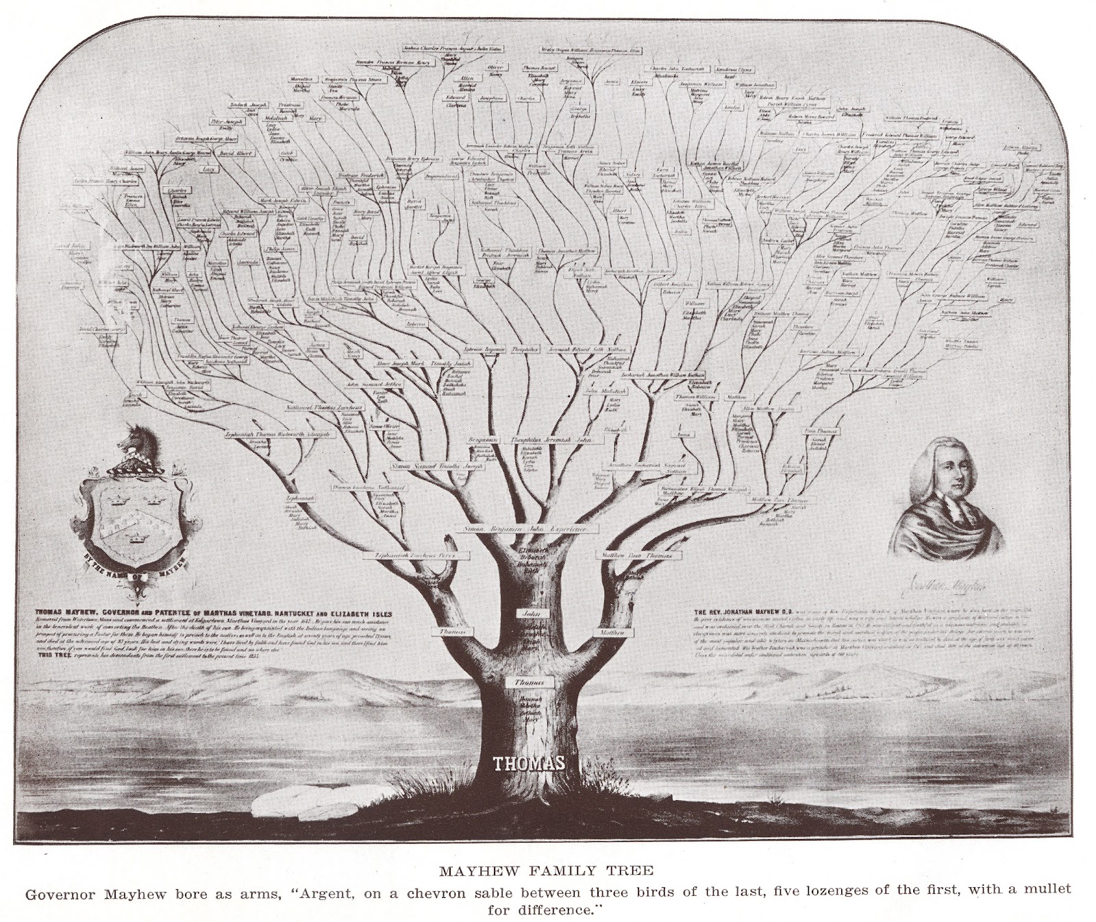
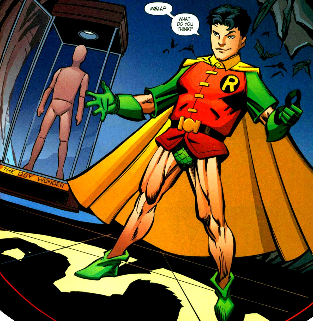
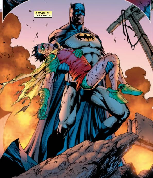
(This lecture and subject didn't come with much in the way of pictures,
so I've supplemented them with the genealogy of my favourite
Batman character: Jason Todd; The Robin who was made purely
to replace Dick Grayson, because people liked Dick Grayson, right?) 

(As if all these theory lectures feed into one another or something) The subject of subjectivity was brought up, along with Foucault's beliefs surrounding them, that concepts are something that we can create for, not only things that we ourselves create, things that have already been created. 
Subjectivity, in this way, is a tool. It's a way for us to form our own personal inquires that we have made on a subject, and for us to build and investigate upon when conducting our research.

Subjectivity comes with our own, personal, perspective. A singular, all encompassing perspective can not and never will exist; but our own perspective? That is always going to be unique, and is something that is worth exploring.

(Speaking of personal perspective, Jason Todd as Robin (Batman's sidekick) was
much more gritty and harsh that Dick Grayson. I, personally, am very fond of this
sort of character, as it creates a more realistic and abrassive dynamic between
Bruce, as an detached and distant adult, and Robin, a detached and distant teenager.
Unfortunately, the vast majority of people did no like this, so something needed to be donet.)

So, when it comes to writing about the Genealogies of other people, it's important we explain the angle and context of what it is we are talking about. Because absolute perspectives (or 'Universal Truths) do not exist, it is very important we define the area we intend to study, otherwise we will be left trying to define a subject from every angle, which is impossible.

This essentially means applying the relevant historical context to what it is you are talking about, the perspectives and events we didn't have access to, before we begin discussing our own subjective views. This context (or the contingencies) we use to define what it we discuss can only defined by us, through our own writings and methods.

(Much like, rather than discussing all of Batman, I chose to focus exclusively on a single facet;
The character of Jason Todd... speaking of which:
The audience of Batman at the time of publication pettitioned for Jason Todd's
character to be killed off. So DC held a phone in scheme, where people could pay to
decide his fate. The split was very close to 50/50, but the vocal minority were louder 
(voted more) and ultimately, rather than rework the character, DC simply killed him)

When we come to writing our responses, there is a very ineloquent way to go about it... at least, that's how I've chosen to record it and it makes sense to me;

If we thing of a thing, whilst we look at something, then whatever it is come to think and understand about that thing, is valid and relevant to our own, personal and subjective, view point.
In this vain of thinking, it's simply not the things that we choose to research that are important: It's how we think about the things we choose to research, and how we choose to explain and represent how and why we think this way, and ultimately what this may mean, if only on a personal level.

(Content to have its cake and eat it too: DC decided to bring Jason back from the dead
,breaking a long standing tradition that, along with Uncle Ben; Jason Todd stayed dead no matter what.
From here he became his own character, The Red Hood, The training and skill of Batman, but with no hang ups about killing people.
This, whilst frustrating from the view point of a character meeting a concluded end, reintroduces the gritty dynamic 
Jason and Bruce had, which I was very fond of, Only this time with the point of contention being 
Batman's biggest moral hang up, leading to a lot of intense (and often entertaining) confrontation)
The way we should be thinking, when writing our own, subjective, theories on topics who's histories are not ultimately or universally defined (I.E; all of them) is like we are paranoid. Believing like there is some overarching theory, and we only understand a fraction of it, when investigating a case study, is the way we'll end up producing the most interesting pieces of writing and analysis.
Finally, as a closing statement to cap this whole thing off:
The things that we think, when regarding our analysis into subjects, should simply be the foundations that we build our own subjective and personal theories that try and explain and account for everything going on within our case studies, both in terms of the study itself and whatever it is we think regarding that study.
(Don't worry, I'm nearly done talking about a comic book character on a graphics blog post.
  When discussing Jason Todd; I ultimately believe him to be incredibly flawed, both in terms as a character, who is abrasive and callous (not
to mention murderous), but in his inception and his real world analouge, that he was created a grittier replacement to the first Robin, simply to sell
more comics, and then brought back, literally, from the dead to try and make him popular with seemingly no regard to what the readership wanted.
However, this is also why I enjoy him so much. His character flaws only serve to make him more relateable and human (or as human as a zombie
batman character could be), and his rough conceptual history gives him something of a success story, when compared to his recent portrayals in
films such as 'Under The Red Hood' and games like 'Arkham Knight' (and maybe even Batman vs Superman, if the grapevine is to be believed), as well 
as his run as a solo hero in comics which has been ultimately praised for its story and art, makes him truly a character you can root for.
As such, Jason Todd is my favourite character, and I'm sorry I used this blog post as an excuse to talk about him.) 

The History of Graphic Design

Graphic Design, at least when compared to the other creative disciplines like Fine Art and Sculpting, is a very new subject and, as such, is somewhat easier to quantify in terms of its history (at least, somewhat.)


Graphic Design could be argued for being as old as humans have been sprawling art on walls, or since signs and banners have hung over market stalls and kingdom's armies; but if we were to argue that then we'd be here all day, so we're not going to.
Instead, we'll just mention that, with the invention of the printing press and the designing of typefaces to be used in these prints; the seeds for what we would come to know as 'Graphic Design' were sown, in the late 19th century.

From there, the 'Modernist' movement was born in the early 1900s, reflecting the form and strength of the established constructivism movement at the time, accepting and even embracing the truth in materials; that the tools you were using were all flat, and should be presented as such.


However, from this 'flatness' bore witness to several new distinct styles emerging from all over the world, reflecting the societal and political climate of the time.
Russian Constructivism was an attempt to reinvent the rules of visual communication, rejecting refined aesthetics in favour of dramatic and unconventional perspectives with vivid contrast with limited colour pallets. This was both a reflection of, as well as an effort to perpetuate, the rise of a worker's revolution at the time.


Constructivism helped play a major part in one of the most, if not thee most, visual styles of the modern day; The Bauhaus. Created from a school of thought in central Europe from 1919 to 1933, The Bauhaus characterises itself on its simplicity, abundance of white space, sans-serif typography, a move away from hand rendered illustration towards photography, and a distinct asymmetry in its layout.


This school of design was interrupted by the breakout of WW2 and, as such, the leading thought in graphic design was forced out of Europe into the United States, bringing the styles and teachings with them, creating the standard for the decades after the war.

This standard would later become known as Swiss design, known because of the advent of the world's favourite, and Swiss, font Helvetica, as well as the heavy reliance on grid systems for page layouts, reflecting the rise in corporate and capitalist thinking in the west during this time.


Permeating this entire timeline existed a slightly less mainstream and accepted approach to graphic design, known as dadasim, or simply 'often nonsensical experiments that tried to invoke emotions, rather than convey specific information', to give it its full name. These trends date back as far as the very late 1800s, and continued up until the 1970s until graphic designers began to tire of the rigid and simplistic nature of the designs they were creating, leading to the advent of Post-Modernism.


Post-Modernism sought to reject the imposed rules that Swiss and Bauhaus had imposed, choosing exuberance and exaggeration over form and informed design, a stylish mishmash of emotional response that cared less about what was being shown, but rather the way it was being shown.


And these two schools of though, the Modernist, Swiss and Bauhaus elegant design, and the more anarchic and emotional driven Post-Modernist design are what governs the world of Graphic Design today, with both still emerging in various places to varying degrees today.
However, due to the digital and information driven age we live in today, Modernist design's form and simplicity is resurging greatly, being implemented in interactive media, such as web-content as games, where the distorted and unclear nature of post-modernism would clutter and hinder the effectiveness of such content.


Friday, 20 November 2015

A history of Subjectivity

Subjectivity is all about our responses. It's about how we respond and why respond, what causes us to respond to what we see.

It is dictated by as much our culture, as well as the things that happen to us. Subjectivity both relates not only to the subjects that we see, but also us, as subjects, and is mostly a product of the culture and society that created us.

The two main schools of though for how our subjectivity is thought about and perceived to work, comes from both the early 20th century Psychoanalysts, as well as the mid 20th century Social philosophers.


Sigmund Freud argued that, our ultimate understanding on subjectivity hinged on our understanding of out subconscious, that our subconscious dictates our needs and desires, and is only satisfied when it is relieved of these things.
In this way, it is perceived that anything that are subconscious deems as not meeting these requires is viewed unfavourably, whilst everything else, it.

With these revelations at the turn of the century, a new wave of futurist content swept across the western world, highlighting a possible link between cultural enrichment and scientific understanding.

The other school of thought, by people such as Michelle Foucault, believed that we become subjects of the institutions that we are subjected to, as well as the ones we subject ourselves to. These schools of belief saw knowledge and truths as more constructs that were built up to help strengthen the ideas already present in society.
He argued that, hysteria and other such 'illness' didn't exist, until psychoanalysts like Freud defined them.


Foucault thought that history was a much more organic and interpretive exercise, and that motivation and feelings are just as important, if not more so, than the facts themselves, believing that even failures and mistakes in history are a way to see as a result of a problem someone faced at the time.

These thoughts and practices are still carried on with modern day practitioners today, like Sarah Lucas, that believe a refusal to accept the lessons and histories of old prevents people who are negatively subjectified by them to resist conforming to their expectations, leading to much more enlightened and positive change in the world.

A Fantastic story about trying to get a placement.

The guest lecture with graphic designer and web developer Miles Thorp was, for better or for worse, the shortest guest lecture we've had. He made his points rather rapidly and with very little need for explanation, giving a lot of insight into his personal experience both trying to get onto a placement with an advertising agency, and becoming the one in charge of hiring future placementees.

Being a web developer at his core; Miles places a lot of emphasis on knowing how the digital advertising world worked, as the world we lived in didn't favour the traditional specialist any more, and that knowing as much as you can amongst as many disciplines as possible is the only sure-fire way to ensure you can remain employable in today's market.


Beyond this, a lot of the advice he gave was all practical.
You need to love what you do, you need to want to do it, otherwise there's no point
People buy people, especially in this industry. If you, as a person, aren't marketable? Then you have no chance in the industry as a designer.

Have a portfolio of your best work, structured to show the best of your best and nothing else, to really be the line in there.

And when you have that placement, you need to be the yes man. The one that can get things done and is there, as long as possible to get the job done.
You need to make sure you ask for that help, when you need it. You're part of a team, helping each other is what you are for

Cut up and Shut up

Wednesday's lectures never fail to impart some new, interesting information that will almost certainly benefit me somewhere down the line.... but this often pails in comparison in which the way that this information is imparted onto me.

The idea for this lecture was that, there were multiple ways to look at your work. That perspective is everything and maybe, taking a step back, reworking your work and being far less precious about what your produce can lead to much better work than you may have thought.

The way this was displayed was by going to town on a magazine with some scissors, and then putting them back together like some sort of Frankenstein's monster of art and design.

Here's what I made.

 The excise was all about the over arching theme of convergence, and how forcibly bringing ideas and techniques together can bring about amazing and unique results; and, in the case of the work about, it is very unique!

But, if I'm being honest, the biggest thing I learn was making a mess with paper was all fun and games until you need to clear it all up again.

Upon Reflection (in my writing)

I really don't want to talk all that much about Reflective Writing in this context... mostly because I'm arrogant and I think I've got the whole thing nailed; but it can't really hurt to go over it, make sure I can walk the walk as well as walk some walk.

In a nutshell, Reflective Writing is how we actively think about our own work, be it our writing or our practical experiments, and is a near constant and ongoing process of trying to objectively value your own work whilst still adding personal, subjective comments.

It's a touch contradictory, at least at times, but it's not too hard when you wrap your head around it.

The main outcome, with any reflective exercise, is to see how one can improve, even when looking in the mirror (or, in my case, especially when looking in the mirror). It's a process where we think and discuss the flaws and successes in our work, taking the good and tying to adapt the bad into better.

It's not about bragging.
(though, that doesn't mean I can't try slipping some in there on the sly)

So long as you have recognised an element in your work that you think can improve some future work, then you've done it right. That's all there is to it.

Genealogies (in a bottle)


Genealogies are, as I understand them, the way we describe the process of how a problem is solved.
They're a way of thinking about how we come to the solutions we implement, and how and when each step was relevant to getting us to the end.

In essence, imagine a broccoli that was grown from the tickley, bushy end first all the way to that stalk looking thing at the bottom... Except this broccoli is delicious to all ages and not just those over a certain age who have lost their spirit and have resigned their life to eating green, watery plants....

We're getting off topic....


They function in the same way as a family tree, yet a family tree of ideas. You want to start with the initial ancestors of what will eventually become your idea, working your way towards it until finally you have some completed amalgamation of influences and concepts, bringing together one good idea.

Though, the single most important thing to consider when talking about Genealogies, at least as a process for practice, is that each strand, each little brushle of broccoli, needs to made with a problem to solve in mind. Whether it's a practical problem like 'how as we going to keep CO2 emissions down' or 'how am I going to communicate how amazing airwaves, minty-fresh, sinus-clearing gum', these are all problems that need to be solved in one way or another, and Genealogies are one way of working towards the solutions.

Thursday, 29 October 2015

"Design isn't designing": A talk with Ian anderson.

The talk with Ian Anderson was a 'real talk'. It was long, had many tangents and digressions and, occasionally it felt like nothing was really said at all; but every word he said was from knowledge and passion, even if a solid ten minutes was talking about Letrasets and bands that I'm not even convinced the tutors recognised.

But, now I'm digressing...

The talk was all a slough of industry experience and various anecdotes relating to the various graphic design projects and how they were constructed and, perhaps infinitely more importantly, why.
The reason I call Ian Anderson's lecture a 'Real' Talk, is because there were some rather hard hitting truths punctuating his discussions on work.

Truths like;
      "Design isn't designing, design is problem solving and (we) need to be able to
             communicate the solution. (We) are not artists"

It hits home how problem and solution orientated graphic design is, and the nature of what it is we really do. "No one will pay us for drawing something pretty, or setting nice type", we need to be able to effectively interact with audiences, communicate with them, tell them our ideas.
Make them give a damn.


And even if I already knew, and hate being reminded; being told that "You don't need to like the design at the end for it to work". It's true, in College and the (admittedly few) freelance posters I did, the end result has most always had a begrudging element of compromise that I wouldn't have ever added if I had all the control... but how Ian followed it up was much more powerful and empowering, as well as making the compromise dilemma feel not as soul crushing.

      "-Enjoy the solution, how you solve the problem is yours; how you choose
             to represent that solution is not"

I was also fortunate to share a brief few words with him, much to his chagrin I assume, after talking for as long as he did, discussing Typography. Iain held it in such high esteem, it is simply what he kept coming back to, more than anything else, saying"No matter how much you know about typography, you need to know more"
So I asked, what is the most common typographic 'law'?

Typography isn't written, it's spoken. It needs to be heard by the audience. Are you shouting? Are you whispering? What's your inflection? It's important to consider how somehow might read your work, how someone might interpret it. Typography isn't just words on a page, it's a message. An idea you are presenting to someone. You need to make sure you present it well.


The 'real talk' was so vast and informative, I really could write for page after page about what I took away, even if the notes I took were somewhat limited.
The fact is; While Ian's talk may have lasted for hours, and covered a whole alphabet's worth of topics, everything he said wasn't as simple as a statement. It was only after he started finishing, elaborating and explaining that you began to see what was what and why...
Really, he summed it up best.

"Being a graphic designer isn't about the mark that you make; it's about why you make it"

Wednesday, 28 October 2015

Researching research.

Research needs to be focused. You're working away something, as well as towards something, and that your research needs to change and adapt as you're going along. These facts needed to be kept in mind at all times whilst you work, or you'll end up with some pointless facts that aren't helpful, or nothing at all.

This is essentially what happens when you're told to guess a completely random object with only a set number of questions you created before you where even told to think of the object.

(The object was a pumpkin, if you were wondering. I was trying to get into the spirit of Halloween, not that it helped anyone else who had to to guess, though)

Research is a fluid process, it constantly changes and needs to be changed to keep your ideas from going stagnant, as well as to ensure you're not stuck on a linear path. Research is best conducted in subjects you find most appealing or natural, as you're able to more comfortably and enjoyably explore them; and the process of research should always strive to be intriguing, even more so than solving problems.

No interesting or exciting idea came from research that wasn't passionate.

About Me

I was told to make a blog, for university, and people took this very seriously. And I'm not saying that I haven't (or that there's anything wrong with serious) but I think the best work is made when you are having fun and enjoying what you do. So I'm going to make this enjoyable; both for me and those who end up reading it. And what's more fun than being corporate?! Wait. That doesn't sound correct at all. No matter! I've turned this blog (and myself!) into a brand! A company! An idea... and as batman always says, ideas can't be killed. (But I can please don't kill me) Wow. I am getting sidetracked. Fun! Excitement! Intrigue... These are some of the things you may or may not find here. Because it's mostly going to be graphics work. And writings, about graphics work. Probably both... But I've been known to do what I please. I'm a maverick, a loose cannon. You don't know what I'm going to do next. Probably some really good work. I ran out of things to say about 2 paragraphs ago, what are you still doing here? You should really be looking at all my academic work, it’s much more impressive and interesting than, whatever this is.